Amprion Procurement Insights — Key Visual and Motion Design


Services:
Key Visual, Motion Design
©2025
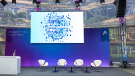
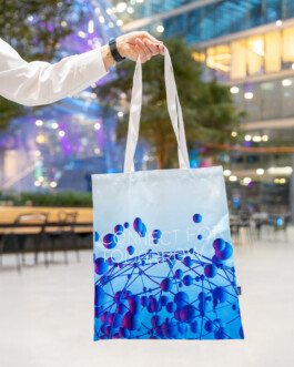
For Amprion’s Procurement Insights 2025 I created an animated key visual and a motion design system that shaped the event’s visual identity across stage screens, slides, and supporting media. To me, Amprion motion design meant translating complex energy topics into something clear, energetic, and easy to read, especially on large screens in a live setting.
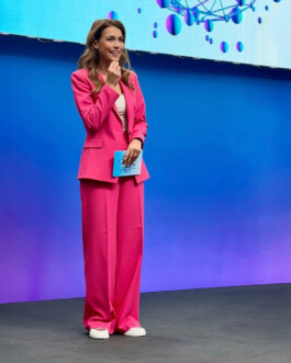
The event took place over two intensive days at the EUREF campus in Düsseldorf and welcomed around 400 guests, with the guiding theme “Connect for tomorrow” appearing as a core message of the format. The programme was hosted by TV moderator Annett Möller.
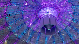
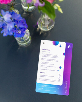
Visually, the concept translates the idea of energy flow into an animated, interactive graphic language built as a connected, pulsing structure. It mirrors speed, efficiency, and technical innovation, and reflects how smoothly things can work when many stakeholders align. The colour palette uses the brand’s typical accent tones, including cyan and fuchsia, to create strong recognition and a distinct identity. Dynamic movement and rhythmic transitions symbolise collaboration with suppliers and partners, while keeping typography crisp and readable on large stage screens, and scalable for slides and digital formats.
If you would like to see more projects in a similar direction, you can explore further motion design projects on my Instagram or check out other projects here.
Amprion Procurement Insights — Key Visual and Motion Design


For Amprion’s Procurement Insights 2025 I created an animated key visual and a motion design system that shaped the event’s visual identity across stage screens, slides, and supporting media. To me, Amprion motion design meant translating complex energy topics into something clear, energetic, and easy to read, especially on large screens in a live setting.
The event took place over two intensive days at the EUREF campus in Düsseldorf and welcomed around 400 guests, with the guiding theme “Connect for tomorrow” appearing as a core message of the format. The programme was hosted by TV moderator Annett Möller.
Visually, the concept translates the idea of energy flow into an animated, interactive graphic language built as a connected, pulsing structure. It mirrors speed, efficiency, and technical innovation, and reflects how smoothly things can work when many stakeholders align. The colour palette uses the brand’s typical accent tones, including cyan and fuchsia, to create strong recognition and a distinct identity. Dynamic movement and rhythmic transitions symbolise collaboration with suppliers and partners, while keeping typography crisp and readable on large stage screens, and scalable for slides and digital formats.
If you would like to see more projects in a similar direction, you can explore further motion design projects on my Instagram or check out other projects here.
Services:
Key Visual, Motion Design
©2025